US Constitution
I spent some time recently looking at the high-resolution scans of historical documents posted by the US National Archives.
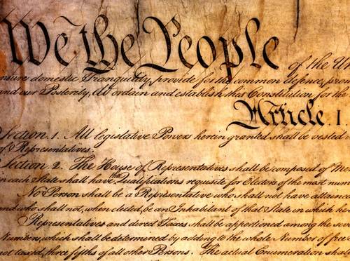
I'm fascinated by the penmanship. A. Jacob Shallus, assistant clerk of the Pennsylvania State Assembly, was paid $30 for his services as an engrosser, truly a lost art in the civil service.
I wonder if, 200 years from now, people will stare in awe at typewritten pages from the mid-twentieth century, wondering how the authors managed to create such distinctive, attractive -- but imperfect -- fonts. The use of a typewriter will be as foreign to them as the use of quill pen is to me.
I'd like to call your attention to two highlights in the detail above:
The infamous "three-fifths" clause is introduced at the bottom of this detail, whereby each slave was counted as 3/5 of a person for the purposes of determining the population of a state, a practice that was obsoleted by Amendment XIV in 1868.
I'm fascinated by the penmanship. A. Jacob Shallus, assistant clerk of the Pennsylvania State Assembly, was paid $30 for his services as an engrosser, truly a lost art in the civil service.
I wonder if, 200 years from now, people will stare in awe at typewritten pages from the mid-twentieth century, wondering how the authors managed to create such distinctive, attractive -- but imperfect -- fonts. The use of a typewriter will be as foreign to them as the use of quill pen is to me.
I'd like to call your attention to two highlights in the detail above:
- The 'A' in Article I -- you'll walk a long way before you run into an alpha like that these days
- In the second line of Section 2, notice the neatly inserted "the". How sweet is that?
The infamous "three-fifths" clause is introduced at the bottom of this detail, whereby each slave was counted as 3/5 of a person for the purposes of determining the population of a state, a practice that was obsoleted by Amendment XIV in 1868.