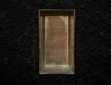
sunday at moma...3
this is a test
of my memory
of the color balance of my monitor
the color balance of yours
and your memory
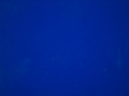
what is this?
i hope you answered an yves klein blue painting (because that's what it is)
so, for all of those who would like to participate
let me know what you see...
was it obvious?
is it too red?
too yellow?
not even close?
(here it is at the tate, how did they do?)
we won't know anything about the answers to the questions above in a definitive way, but we will in a relative way
and, if bruce says it's too red and fernando says too yellow, how are they seeing each other's images...
ok, silly i know
but it's my little way of sharing what really struck me today
of my memory
of the color balance of my monitor
the color balance of yours
and your memory
what is this?
i hope you answered an yves klein blue painting (because that's what it is)
so, for all of those who would like to participate
let me know what you see...
was it obvious?
is it too red?
too yellow?
not even close?
(here it is at the tate, how did they do?)
we won't know anything about the answers to the questions above in a definitive way, but we will in a relative way
and, if bruce says it's too red and fernando says too yellow, how are they seeing each other's images...
ok, silly i know
but it's my little way of sharing what really struck me today