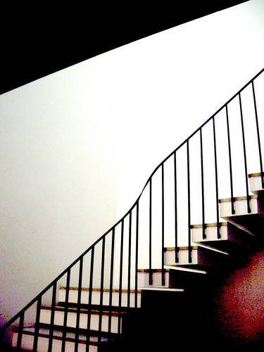
balance ( linked as your suggestion )
in fact i do not know if you would set the 3 links in the same order as they had been uploaded , or maybe with the horizontal one between the others...
or what ever
anyway, you were right once more.
hug you,neene
......................................................................
......................................................................
30 - OCTOBER - 2005
this is how i see the links arrangement
following mostly the movement of the stairs, going on as a sinuous line
now i'll try the horizontal thumb. at the base, as a balanced and solid whole image.
hug you again
TO THOSE WHO ARE HERE AFTER THE 29-0CT-2005 : the middle thumbnail was the top one , that is the reason of neene's comment.
today it have been moved to the middle position , just to see how it would look like (trial&error + learning)
©2004 jkossatz, all rights reserved


